When comparing dashboards between Datadog and Grafana, we often find discrepancies between them. Even though both Datadog and Grafana scrape metrics from the same source, we see vastly differing visualizations and we often wonder which has a better accuracy compared to the source of truth. In this blog post, we explore the discrepancies between Grafana and DataDog dashboards and how we can resolve/understand them. We begin by giving a brief overview on the data (or metrics) being collected.
Openmetrics
Openmetrics is the standard for collecting metrics. It supports text format representation that allows applications and infrastructure resources to post text-based metrics on an endpoint (eg. https://xxx:8080/metrics) and allow agents to scrape (collect) metrics from that webpage. An example of the text-format metrics is shown here: https://prometheus.io/docs/instrumenting/exposition_formats/#text-based-format.
We follow this methodology and allow Prometheus and Datadog agents to scrape metrics. Here is an example:
| |
From viewing the metrics, we notice two types:
- Summaries (metrics that end in
_sumand_count) - Histograms (metrics that end in
_bucket)
Summaries
Based on the description of a summary: https://prometheus.io/docs/concepts/metric_types/#summary:
- the total sum of all observed values, exposed as
<basename>_sum - the count of events that have been observed, exposed as
<basename>_count
Note that they are counters and so they are always increasing. For more reference, please visit here: https://prometheus.io/docs/practices/histograms/#count-and-sum-of-observations.
For the usecase going forward for summaries, we’ll use am_request_count metric as example.
Grafana Dashboard for Request Count for /healthz endpoint
The graph shown below is for the Last 15 minutes of the Request Count for /healthz endpoint. As you can see, the value is almost-flat at 55 - 56 req/sec. An important note about a Grafana dashboard is that the smallest granularity (or shortest interval) between data points is 30 seconds if the time period (highlighted in yellow box on the first screenshot below) is small enough from Last 5 mins till Last 3 hours. After that, it becomes 1 min, 2min, 4min etc. for longer time periods (Last 6 hours, Last 12 hours,…).
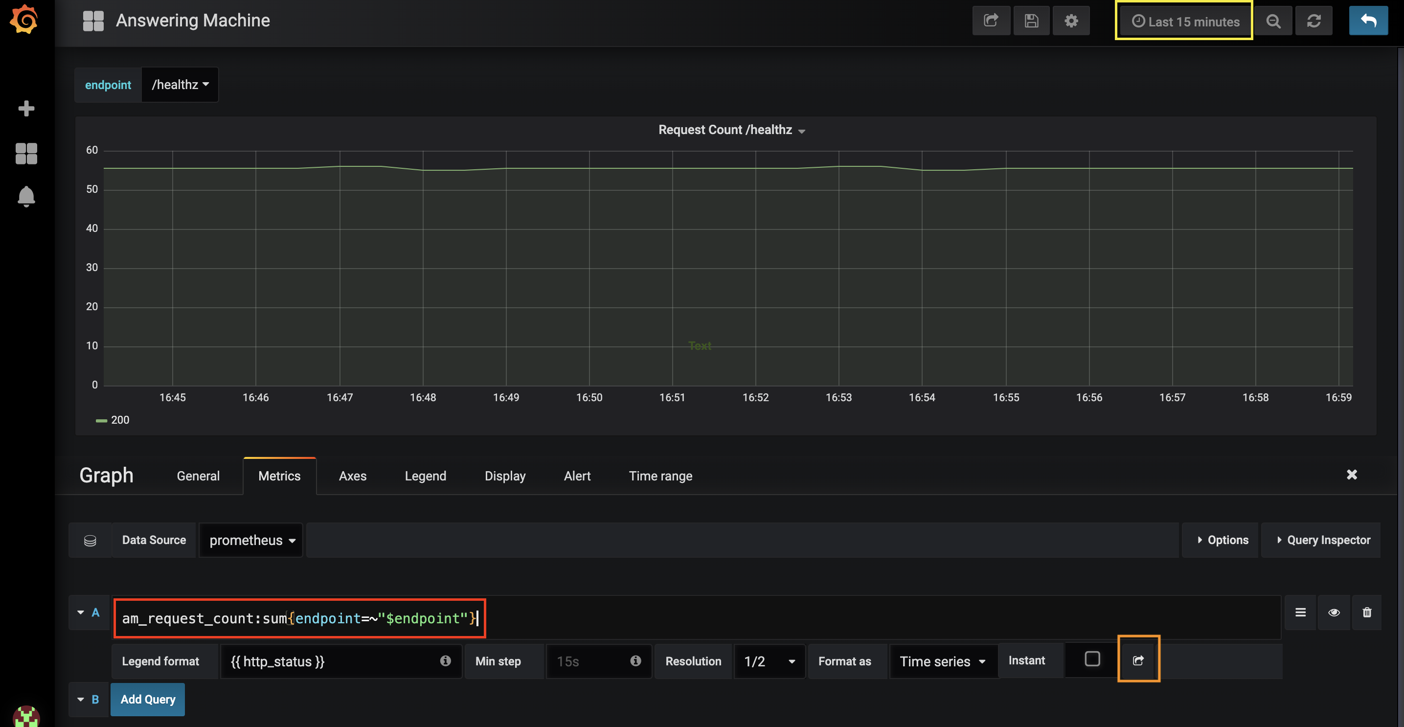
The Prometheus query is: am_request_count:sum(endpoint=~"$endpoint").
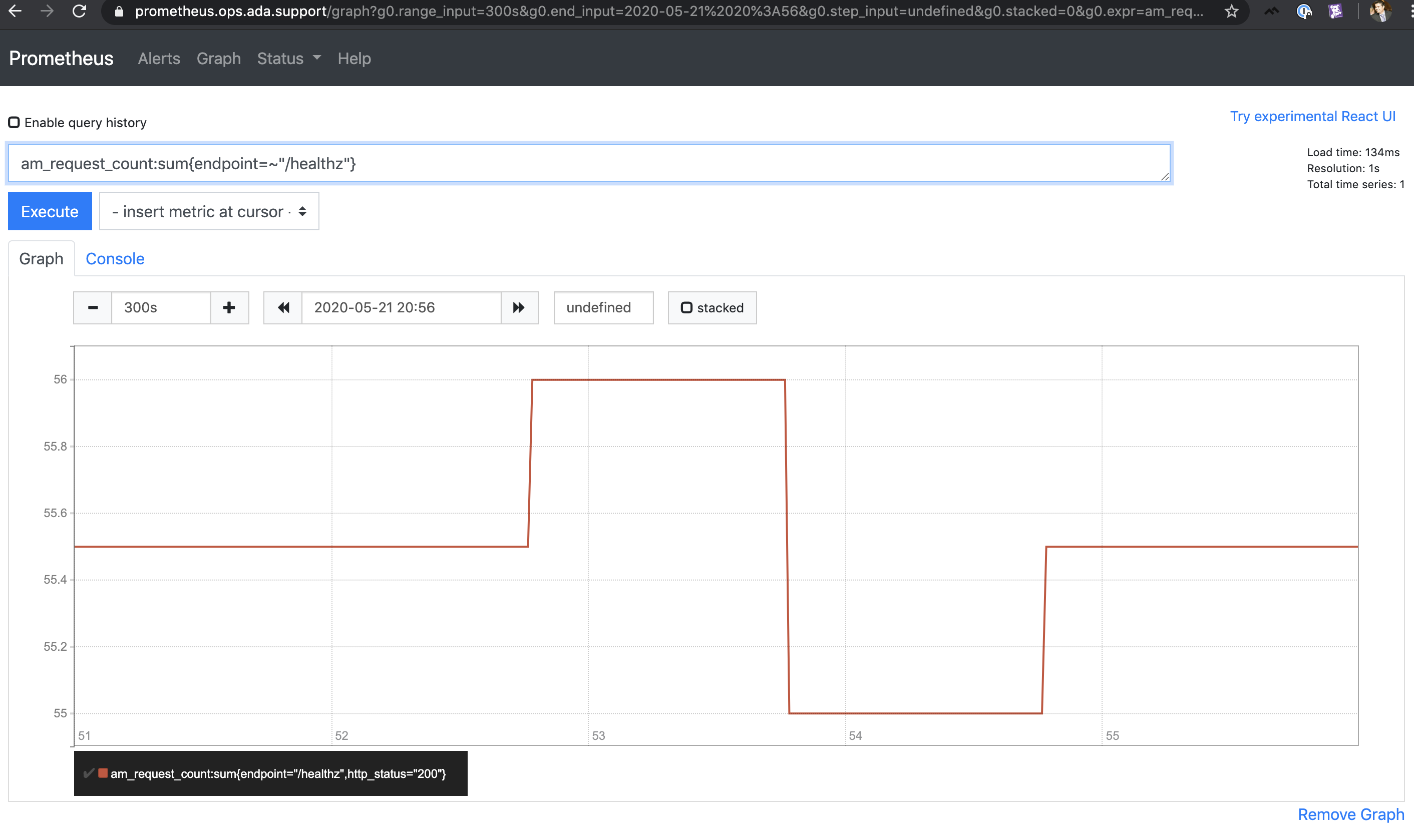
From looking at the Prometheus dashboard above, we can confirm the value stays within 55-56.
DataDog Dashboard for Request Count for /healthz endpoint
Now we replicate the same Grafana dashboard:
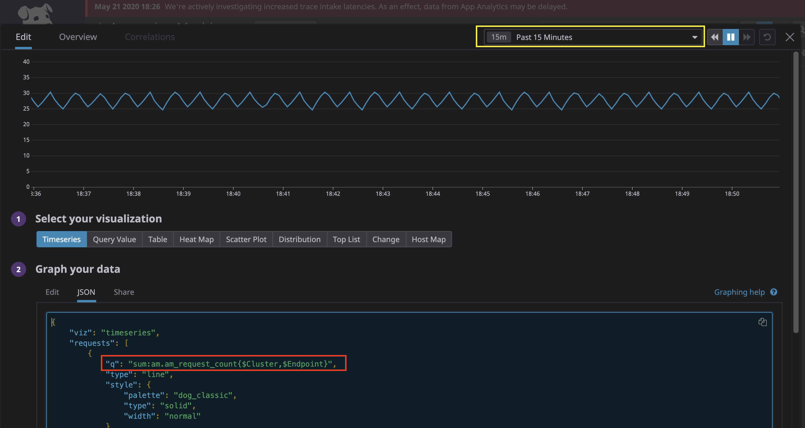
As you can see, the values are widely different (values fluctuate around 25-30). Why?
Main cause of discrepancy: Data Interval Granularity
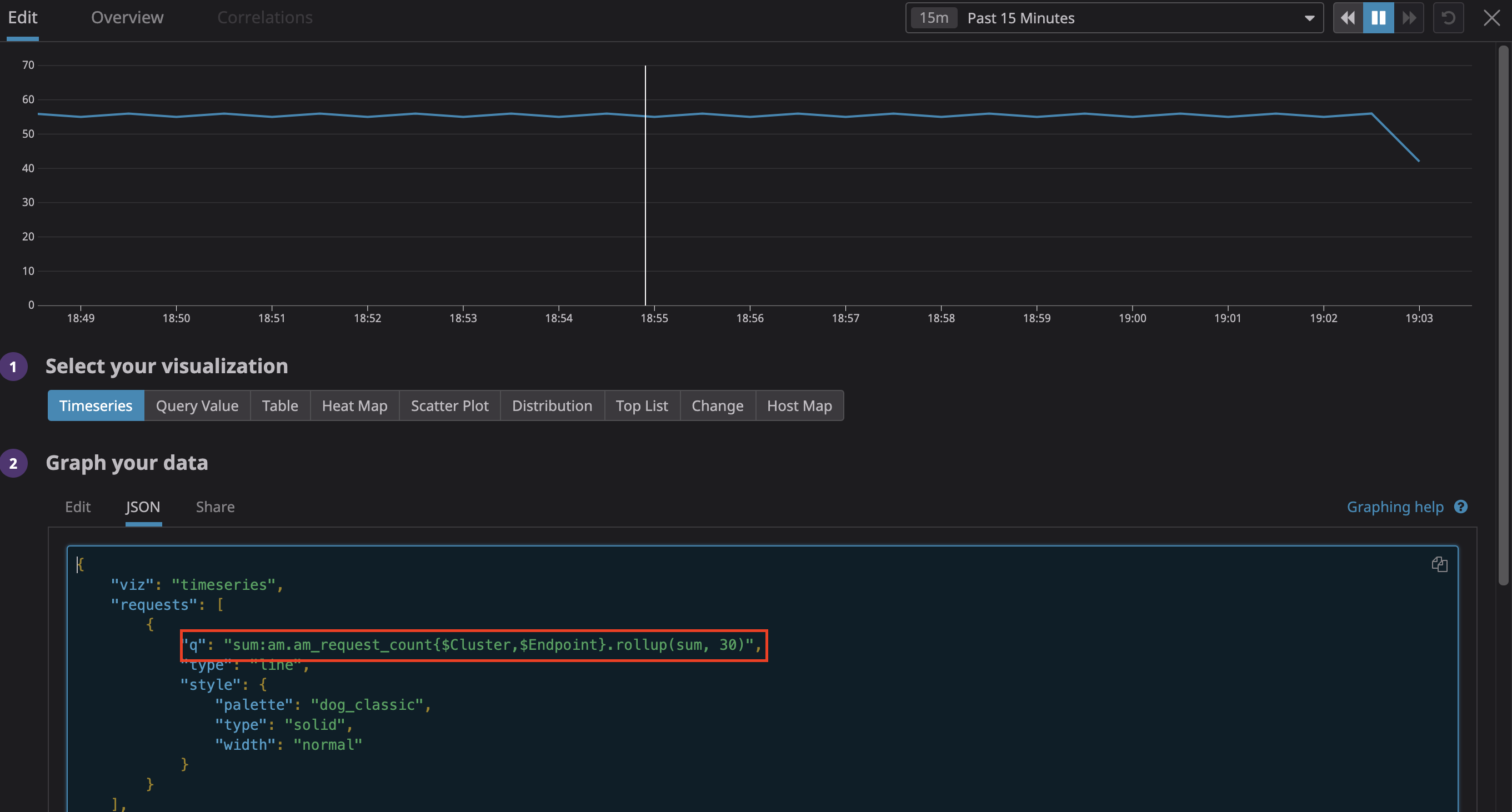
Datadog’s granularity is 5 secs (as opposed to 30 secs in Grafana) for the Past 15 Minutes. Also, Datadog’s interval increases as the time period widens (same as Grafana). The main reason is that Datadog has a restriction of maximum 300 datapoints in the graph (regardless of the time period). Thus, as the time frame widens, each data point will represent more and more of an aggregated value (and vice versa if time period is shortened).
Therefore, not much aggregation happens for Past 15 minutes time period in DataDog. Now, if we aggregate to 30 secs, the graph look similar to Grafana as shown below:
 .
.
Conclusion
Grafana does a lot of aggregation compared to Datadog. For more information regarding data aggregation in DataDog, please refer to: https://docs.datadoghq.com/dashboards/querying/#rollup-to-aggregate-over-time.
